Friday, September 24, 2010

More Samples of Monochromatic Art


by Emma gr 4
I wanted to share with you some samples of the
Monochromatic art pieces that all my students
created in the first weeks of school. 

We have them framed on a simple colored background and put on display in the cafeteria and going up the steps in our main entrance of school.  

by Libby Gr 4

by Mitchell gr 6


The monochromatic art pieces are now loaded on our school's page of the Artsonia website. 
Click  here  if you'd like to view them.  Once you are on our school page, there is also an option that you can set it to have the art cycle in a slide show by clicking on that option.

by Maeve gr 6


by Meg gr.3


by Claire gr. 4

by Rachel gr 6


by Ceci gr. 4


by Jade gr.6

by John gr. 6


Thursday, September 23, 2010

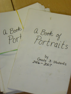
Self Published Portrait Booklets


Several years ago, I worked with some third grade students on making some books with portrait ideas in them.  The students submitted drawings that they had done in pencil and I copied them on the office copier and reduced them to fit on a half sheet of paper.  I was able to fit 4 faces to a page.  When the booklet opens you see 8 portraits on the two pages.  It has provided a lot of inspiration for the students at my school.  They have colored some of them in and in the blank spaces more portraits have been added.  Sometimes the features were added or embellished.  A fun thing was to leave off some of the details when the book was originally made, and the students have added those missing characteristics as they have had time.  The last few pages were blank, but have been filled in with more portraits as time goes by.

Tuesday, September 21, 2010

Self Portraits for a New School Year

We've been using the self portrait mirrors in my grade 3 - 6 art room this fall to create our newest self portraits.  It has been going well, because the mirror tiles are mounted on cardboard and they are propped up tent style on the table.  I have taped the edges with duct tape and secured the bottom with a string that will only let the mirrors stay open at a desired spread. 

self portrait mirror and sample work

On the first day I introduced the rule of 1/2  for the placement of the features.  We also worked on the primary and secondary wedges of a personal color wheel.  I showed everyone how to find a colors complement by finding the color directly across on the wheel.  The children drew their self portraits in pencil and most finished within  the 40 minutes. 

Next class period, I demonstrated the mixing of 2 complementary colors plus a little white would give a variety of neutral colors.  I assigned the color combinations by table so that the paint palettes could be shared.  I was very happy with the variety of  grayish backgrounds that resulted from our color mixing.  In my opinion, the most beautiful ones came from the yellow & violet mixtures. 
mixing neutrals from 2 complementary colors + white

As we move along, the next steps will be to block in skin and hair with tempera paint.  We will wait for the paint to dry and in the following class periods we will go back in with crayon, and oil crayon to add texture into the hair.  I think that for the irises of the eyes we will used blended colored pencil.   Perhaps we will enliven the skin with some subtle blending of chalk over the dried tempera. 

Our skin tone mixing palettes go onto a large tray and are covered by a plastic garbage bag for the night.  We will re-used these tomorrow. 

I think some of these colored pencils might work great for lip and eye detail.  We'll use them over the dried tempera.

I hope these finishing touches will really put a personalized touch on our self portraits for this school year.  The students will be free to create any kind of shirt.  I would like to encourage bright colors or patterns for the clothing.  It will be fun to see what they come up with for the shirts, because our school usually has a dress code of solid color polo shirts and the colors are limited to just white, navy, and red.

I'm anxious to show you the completed results soon.  Stay tuned for more info.  Later, after the projects are loaded onto the Artsonia website; I'll provide a link to take you to our portrait gallery.

Thursday, September 16, 2010

My Shopping Spree at Wet Paint


 Just inside the door I got stalled looking at the moleskin sketchbooks in all sizes and varieties.  My friends wondered if I would even have time to look at anything else.  They woke me up and reminded me that we arrived within a hour of closing time!  I barely turned the corner and I saw my favorite oil pastels.  I love the Portfolio brand water soluble oil crayons for working on white fabric and for making the large Kathy B's murals from her Kid's Art blog.


Entrance to a Very Fun Store!


Another thing I was impressed to see was several boxes of Color Aid paper.  I haven't used that since my college days, but it sure was great for making my very LARGE color wheel.  Every hue has a tint and shade and there art 220 swatches in the entire box!  I loved doing design assignments with that silk screened paper.  It reminds me of paint swatches that I often swipe from home improvements stores for my students use and when I make bulletin boards in my classroom.  I did not purchase a box, but if I think of something elaborate I may have to dig up some cash to get a box on my next visit.


Creative Window display at Wet Paint

I looked at a book on making zentangles and thought about purchasing it.  I ended up not getting it because I noticed that there was a more basic one published earlier and the one on the shelf was quite advanced.  I think we better start at the beginning and build up to the more advanced techniques.  I may check into ordering the original copy off their website. 


This store had everything to keep an artist happy.


Bye for Now!  I hope to shop here again SOON!
I know I'll want to come back for the fiber reactive dyes.  This is the only place I've been to where you can by open stock dye powders in any color you may want.  I usually have to order mine from Dharma and I have to wait for it to arrive by mail.

Monday, September 13, 2010

Restoration of Vincent VanGogh's Bedroom

photo from Greenwichtime.com
I became aware of the recent project to clean and restore Vincent Van Gogh's Bedroom painting recently.  I happend to be choosing some books for my young readers and  I noticed a newly published leveled reader was written on the topic of this restoration.  I have downloaded a copy for myself and one for our school library. 

a sketch in one of Van Gogh's letters when he was describing his painting

Additionally, I looked at some articles on the internet that described what decisions were being made about the cleaning and restoration of this work of art.  It is known that Vincent himself considered this particular painting as one of his best.  In fact, he made two other versions of this same scene. 

I really enjoyed being able to read the opinions of the conservators by visiting their own blog that they have writen as they went through the process of evaluating, cleaning, and then restoring this artistic treasure.

Wednesday, September 8, 2010

Working with a Monochromatic Color Scheme

The photos in this post may be a bit out of order.  I was having trouble once I got them all loaded into the post and I was unable to move them around. 

Monochromatic Green Cartoon

Table Sign for Blues
The paint spot charm hanging from the bottom has blue-green on this side and blue-violet on the reverse.

     The opening lessons for art this year are coming together nicely.   Last week they were assigned a topic by having a category of art given to them on a tag.  I had these written on tags that were placed on the desks.  When they were ready to start working, they pulled a different tag from a bowl that told them the media to use. 

     I have decided to start with some projects that give the students some amount of freedom to choose the topic, but since we are working with colors on the color wheel they are having some restrictions on the color scheme. This week we are doing the students choice of art topic, but the color is being restricted to a designated color family.  That is assigned simply by the table where the student sits. 
Monochromatic Blue Landscape
     I am re using some signs that hung above the tables in the past, but I added more interest this year by creating shaped extentions that hook on by paperclips.   The middle piece is just a shape cut from construction paper.  The bottom shape looks like a smaller paint blot and it was made by painting on the cut out using the designated color and the 2 colors that are adjacent to it. 


Table Sign for Yellows
Charm on bottom has yellow-green on one side and yellow-orange on the other.
Monochromatic Yellow Design


Color Inspiration from Paint Store!

When these paint sample charts are open they reveal some really beautiful color schemes centered on color taken from several nature photos.  For our use in this lesson, we are looing at the cover only. 


In the photo below, you'll see some different signs that I have posted in the room while we are doing color families.  The students helped think of many different names for the 6 basic colors.  Click on the photo to enlarge it.


Table Sign for Greens
Charm hanging from bottom has yellow-green on one side and blue green on the other side.

Tuesday, September 7, 2010

Collaboration as a Theme for This Year In the Art Room

Last year the theme in the art room was about getting inspired and finding specific sources for inspiration.

I used a very large image of a paint brush and on the bristles we made it look like it was dipped into all the colors of the spectrum.


Our new theme for the 2010 - 2011 school year will be COLLABORATION
Close up of one of the speech bubbles to help students be familiar with our theme this year.
This year the new theme centers on the word "Collaborate".
It has been defined as working together and cooperating with one another to get the most accomplished in art class.

My students are coming up with some expressions to be written on speech bubbles to go above the lions' heads.
I hope to encourage more student talk about the theme of collaboration in the very near future. 

Perhaps those student that finish assigned work early will  make some collaborative art.  I am going to encourage early finishers to work on artist trading cards and I hope to have one painting on stretched canvas completed for each quarter of the school year.