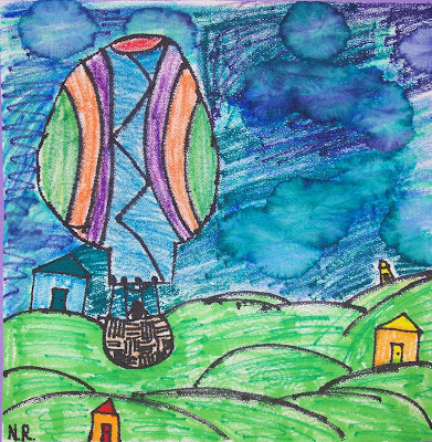
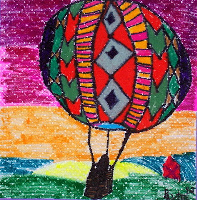
Monday, November 30, 2009

Replica of "The Scream"

Our students recently helped complete a mural version of Edvard Munch's famous Scream painting. We used the Portfolio brand oil crayons as suggested in the directions and we couldn't be more pleased with the final outcome. It was a wonderful addition to our Harvest Concert and it now has a special space in the gallery/hallway between the art and music classroom.


If you are interested, Kathy Barbro of Art Projects for Kids blog has many other fine murals download and print for just a small fee. I printed on heavy cardstock and glued our mural with tacky PVC glue. We painted the border with a metalic gold acrylic, for the museum framed look.


I don't know for sure which mural we'll do next, but I am sure we will do another one or two before end of the school year! Perhaps we will try her new Christmas Nativity and then do the Seurat's Sunday afternoon one this spring.

Thursday, November 19, 2009

Shell Designs

"Super Shells" by Cody grade 5
Students composed the shells and arranged background patterns to highlight the shell shapes.


"Underwater Symphony"
by Rachel grade 5
In 5th grade we took a slightly different approach to the shell assignment. The students did the same observational drawingas the 6ht graders; however, I had them go over the lines in black sharpie ink. This was the first year for having complete sets of watercolor pencils, so I instructed them to draw with them dry and then using a damp brush we liquified the pigment and the colors blended beautifully.
To view the entire class set of shell designs by the 5th grade, please visit Artsonia.

Wednesday, November 11, 2009

Shell Paintings


To see more from this body of work by 6th grade students, please click on the artsonia link to check out the other great work done by the entire grade level.


Students in grade 6 spent some time making observational drawings of shells before creating the final work in mixed media. They chose a shell to take back to their work area and make realistic interpretations of the shell. It helped to draw the contour first and then look to see if the shell had a texture or a special pattern or color design. After the several shells were composed, we covered the shell shape with a heavy application of wax crayon. Sixth grade students took a more painterly approach when they washed in warm blends of brown watercolor for sand and cool blue mixtures for the ocean.


After the paint had dried, some students went back in an drew sand and water textures using colored pencil. Others added water bubbles or spray from the ocean using a white oil crayon.


It was an enjoyable project and the art pieces have been on display in the hallway between the music and art room.

Thursday, October 22, 2009

Happenings at School

Many of our recent projects have been recently finished up. So I will have photos to share with you soon.


Grade 3 made Mondrian style animal

Grade 4 designed Molas with animal motifs

Grade 5 completed beautiful shell drawings and made clay leaf dishes

Grade 6 has made shell paintings and recently started planning for Aboriginal Animal designs


Tomorrow is a big day at school. We are having an all day United Nations Day Celebration. The children will be going to stations set up throughout the school to do crafts, hear guest speakers, listen to music and stories, and play games. They will learn about many traditions that come from other countries. At lunch they will even be served samples of food from around the world.

Wednesday, October 14, 2009

Animals In the Style of Mondrian

Piet Mondrian's Composition in Red, Yellow, and Blue


I have shared two art prints of Piet Mondrian's Boogie Woogie with my 3rd grade classes. Each was a different version from his series called Boogie Woogie. We started to get familiar with some other pieces of his work too. I also showed a photo of a dress that was inspired from his painting. Did you know that Nike has designed athletic shoes that are styled after Mondrian's work too? The trademark slash is black, but the rest of the colors are red, blue, yellow, and white.


Nike Low Dunk shoes released in 2008


Afer having a little discussion about the art examples, we set out to create a large animal silhouette from white cardstock. I had a small booklet of animal shapes that I made from various silhouettes I had found on-line. They looked at frog, giraffe, fish, kangaroo, fox, dolphin, before they considered which they would draw. I showed them how to visualize a box around the animal to see which parts may nearly touch the edge when the animal was enlarged. The students tried to make their animal as large as the paper. We stacked our pattern on top of white cardstock and paper clipped the corners to allow us to cut through both layers.


I will have artwork to post in the blog later.

Tuesday, October 6, 2009

Kuna Yala Mola Gallery | Panama

In fourth grade we have been working on an international art idea where we learned about Panama's Molas. We are experimenting with an efficient way to make this type of a design using colored construction paper.

Here is a link to see some real Molas: Kuna Yala Mola Gallery Panama

Thursday, September 24, 2009

Shells On the Beach

Students took one class period to draw from real shells, before composing the final painting. Shown in the photo are a few sketches of the shells from our observational drawing.

We took two slightly different approaches to the shell assignment. In fifth grade, we drew lightly in pencil and then shaded the edges of the shells using adjacent colors. The backgrounds are being finished up currently using repeated patterns. The pieces are very dynamic and imaginative. In sixth grade, we worked with pencil drawings and developed the shell colors by building up layers of wax crayon. Then a warm brown was mixed up for the sandy area of the beach and cool blues were made for the ocean waters. Salt sprinkled into the wet paint was optional and it created a perceived texture that imitated sand or water. Final details such as swirls and lines in watercolor pencil were added after the water color dried .

Stay tuned for more photos of finished work.

Tuesday, September 22, 2009

Brushes in the Classroom

I keep our classroom brushes on top of the cabinet next to the sink. The cans are held by a 3 inch deep box lid which helps keep the brush storage area organized. We separate the brushes according to the bristle size and type of handle. All the tall easel brushes are in one can. The wide, flat brushes are in a different can. We have three cans that hold smaller, detail brushes.
When children are painting with watercolor paint they are responsible for rinsing out brushes and returning them to the can at the end of class. Notice that the brushes are stored with the bristles upright. I teach my classes to put them back with the "hair in the air". The little rhyme seems to help.
If tempera paint was the chosen media, then I have brushes collected in a soapy water bucket so that they have time to soak and I wash them myself.

Thursday, September 17, 2009

Hot Air Balloon With a Landscape

Nora gr 4

The fourth graders have 
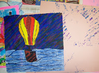
been busy creating a scene of beauty from a hot air balloon. We practiced drawing the shape that is full and round like a sphere or egg and has a narrower opening for the air to fuel the flight. I am always amazed at comparisons students will think of in discussions while we plan projects and today was just a good example of that. One student compared the balloon's form to a persons head and neck. I'd have to agree, they do have the same form. And if that helps someone think of a way to draw that form, all the better.

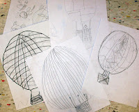
Here are some preliminary sketches they made to help know how to compose the scene on the final paper:

On the next day of class most students were
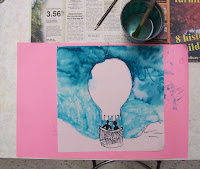
ready to start composing on the final paper. Surprise! We used embossed paper towels for a new and different texture. They drew out the balloon first and then the landscape scenery. This way if the

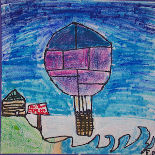
passenger basket hung below the scene it would be overlapping the landforms. From here on out it was a challenge to the artists to set up contrasts of smooth and bumpy textures. We found art media that allowed the texture of the paper towel to show. Markers, especially ones that were slightly dry were perfect in the sky for this effect. So were regular oil crayons when used with little pressure. Often the older unwrapped ones were perfect for rubbing lightly across the surface and they picked up the textures of the paper nicely.
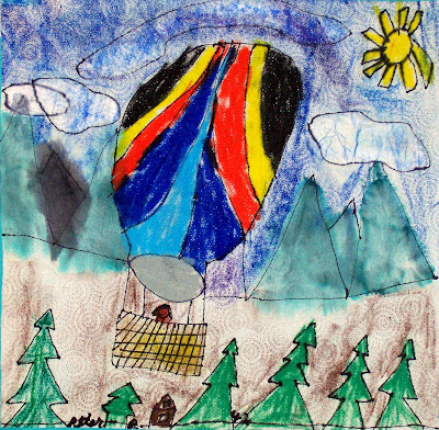
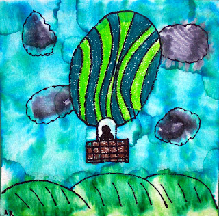

Peter gr 4

When it was time to do the smooth fabric of the balloon I introduced the oil crayons that are water soluble. My favorite brand is made by Portfolio. They are so creamy and smooth and they blend so easily with a fine mist of water from a plastic spray bottle.


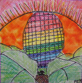
The paper towel was a bit fragile when wet, but the children were careful not to over work the project at this stage. We used an old piece of 12x18 construction paper as a placemat to absorb extra ink and water. In fact, we had more problems with the paper clips when the works were in storage. The clips caused more rips than the damp paper. Once the paper dried it was easily patched from the backside using a small piece of paper towel and gluestick.
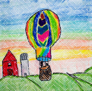

Payton gr4

I mounted everyone's work on a 12x12 square of colored cardstock. Today we had a showing of finished pieces in the artroom and those that were nearly done had additional time to get finished up. I read from an art book while the early finishers sketched and others helped themselves to the Portfolio oil crayons to put on the final touches to the balloons.


This was a new project this year and I am glad we tried it. I am now inspired to create a different lesson for my other grades so they could experience the paper towel as a painting surface.

If you'd like to view more of this series on hot air balloons, this link will take you to the artsonia website where we have exhibited all the 4th graders balloon and landscape compositions.


Wednesday, September 16, 2009

Apple Still Life

http://www.artsonia.com/museum/gallery.asp?exhibit=210971Here are some art examples that would be a great assignment for fall harvest time. Emma gr 3

The 3rd graders tried it out recently and found great success with the painting and printmaking that was involved with the creation of this still life.

Claire gr 3


Lance gr 3


We had a cluster of real apples in the room when we were doing our opening discussion about artists and creating still life arrangements. I had some examples of Henri Matisse's apple still life. We talked about showing the apples from an overhead viewpoint before we drew on the paper. To provide the children with an easy start, they used a 9 inch lid to get the bowl shape started. They could trace around the edge using their choice of a pencil, a yellow marker or a brown marker.
The next class the children talked about color in terms of warm and cool and we planned to paint the background behind the bowl using warm colors on one side and cool colors on the other side with the possibility of blending them a bit just above and beneath the bowl. Yellow could be used on either side to lighten or brighten either color family. We put the pieces in the drying rack until the next art class.


The third day of class I prepared some cross cut apples to use for printmaking. Red, green, and blue paint were available in portion cups. The students painted directly on the cut apple slice and used it to print. I encouraged steady pressure and showed that a slight twist would produce the clearest print. While the apple print was still wet, they painted in the shadow on the same side as the cool background. They were able to blend it into the apples edge.


The 4th class was used for catching up and adding the indentation and stem using markers. The childrne also made up some kind of repeating pattern to follow along the rim of the bowl. Most apples were sitting in the bowl with the stems facing up, but one or two might be tipped sideways in the bowl.


I thought the children did very well at arranging their compositions and I was impressed by blending skills when the backgrounds were added. I would definitely repeat this assignment in the future.

Tessa gr 3

Peter gr 3

To see more works of art in this same series from all our third graders, please click here. The link will take you to Artsonia where we have placed all the apple still life pojects on exhibit.

Monday, September 14, 2009

Storing Artwork at School vs. Sending Work Home


Our school very much enjoys participating on the Artsonia website. Since we have been posting children's artwork on-line it is more available for parents to see what their child is doing in art class and they can let other relatives know where to look on the website to see current art projects.
Having the Artsonia website enables me to save up more projects at school. I like to have many options available to me when I am getting ready to hang a show or put up the annual exhibit at our shopping mall. I do keep all 2-D work together at school by homeroom groups. This way I can include a little bit of everything in an art show at the end of the year. Assignments that are 3-D tend to go home shortly after creation or I assign them closer to the scheduled art show.
I have found that photographing the artwork takes minimal time when I lay them on the floor in a line and just shoot the photo while standing. When I photograph ceramics or other sculptural works I set up a backdrop of paper and photo the object from a stool.
Perhaps you would like to see for yourself what the Artsonia website is all about. Click here to see the homepage and you'll be able to check out the work of many students all around the United States and the world. You'll be amazed.

Friday, September 11, 2009

Our Artist Trading Card Collection

Our trading cards that we have designated as part of our schools permanent  collection are housed in binders.  Our largest binder has cards of all topics.  Shown here are just our cards from the color themes only.  I will blog about our monochromatic cards today.  The binder system works so well because it is a reference to student artists as they are creating for their own collection.  They love seeing cards made by older brothers and sisters.  
     Each binder is filled with cards that were design specifically with an emphasis on that special color. The artist thinks of an idea that can be interpreted in predominately just one color and different values of that same hue.  It is a lot of fun to draw, paint and collage with such a limited color scheme.                                                                                                                 
The black and white binder has some of our all time favorites!  This color combination is so classic and has the best contrast.  Many of the cards started with the inspiration from black and white scrapbookers paper or even a crossword puzzle.  The children were so creative when they put these cards together.  Don't you just have to love the eyes peeking out from the mask on the ATC in the lower left corner?   Some of the value shaded cards turned out spectacularly well.
any school out there willing to plan a trade with grades 3, 4, 5, or 6???
Please let me know in the comment section or by e-mail on my profile.
Thanks for looking!

Thursday, September 10, 2009

Welcome To the Art Blog of Gallery2404

Hello and welcome to my blog about teaching art to children in elementary school. We have students in 3rd through 6th grade. Our young artists have an excellent background in creating and designing thanks to the fine art teachers in the primary school. I see many unique drawings, paintings, and sculptures created in my classes. We also have an avid interest in making artist trading cards and we are willing to trade ATCs with other schools.